Our email editor
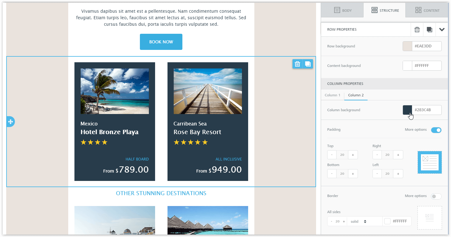
Our editor makes it very easy to create transactional emails or newsletters. With it you can, for example, promote company newsletters, product presentations or special offers, or keep your employees and customers informed regularly.
The advantages:
- drag & drop operation, easy to use without special knowledge
- the emails you create automatically adapt their design to small devices such as tablets or smartphones
- a choice of many different templates for every conceivable purpose
- content can be locked by the administrator or editor (see access permissions)
Responsive email design
What does responsive design mean?
Responsive design is a method of displaying a message adapted to the device it is shown on. Smartphones have smaller displays than desktop monitors or laptops, so emails should adapt to the width. If the email supports this, the content is easier to read and buttons and links are easier to tap. Images are also shown as wide as the device allows.
For emails this is much more complex than for websites, as there is a large number of different email programs (Outlook, Gmail, Web.de, GMX) and, unlike for browsers, there is no common standard for displaying HTML emails.
Responsive vs. non-responsive design
Let us take a look at what responsive design looks like in emails.
Non-adaptive design
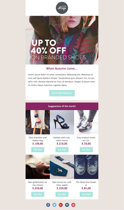
This is a standard email message without optimisation for mobile devices (smartphones, tablets). This is how the email looks on the desktop:
And here is the same message on a smartphone:
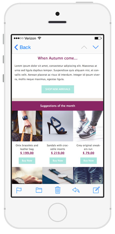
We have exactly the same message on the desktop and on the smartphone. Great, isn't it?
Not really. If you look at the message on a smartphone yourself, you will notice that it is hard to read. The text is small and it is difficult to tap the buttons or links. They are simply too small to touch with a finger. You will find that you almost always have to zoom in to tap or read anything.
Conclusion: not a really good solution! 😢
Adaptive design
Here is the same message – created with our responsive editor – on an iPhone:
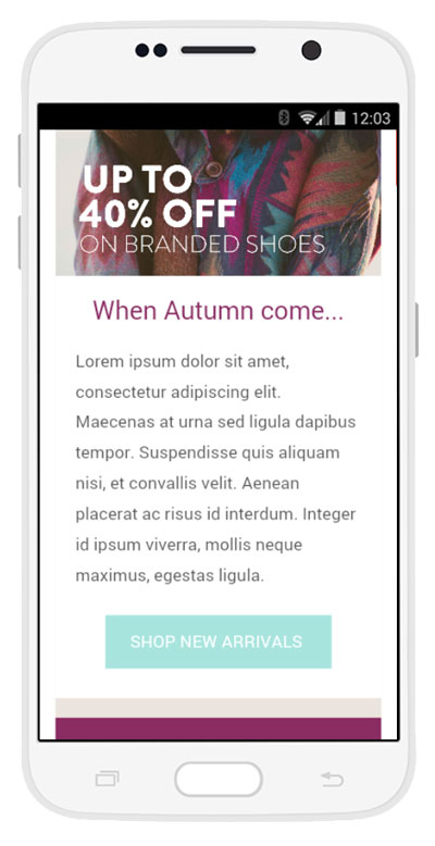
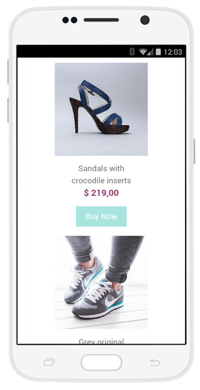
As you can see, the message not only looks very appealing but is also very easy to read on smartphones. The result is a readable email with buttons and links that are easy to tap and no scroll bar. 🎉
Template or draft?
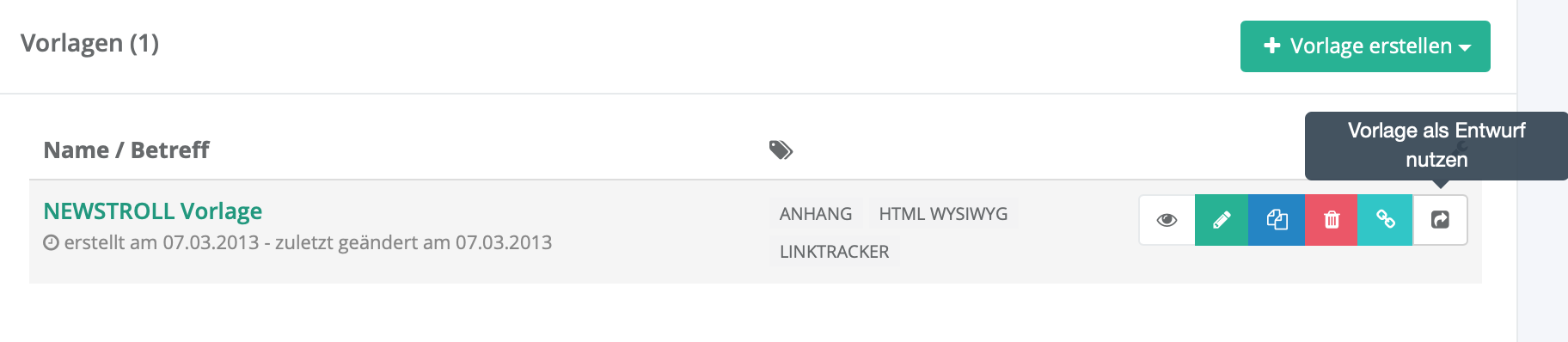
A template serves as the design for new drafts (newsletters). It lets you create an email once and reuse its content for future newsletters again and again. This makes creating new newsletters much easier. Templates cannot be sent and help you keep track. The following templates are usually created:
- transactional email (notification, double opt-in etc.)
- newsletter (if desired, different ones per list / language etc.)
If you have not created a template or would like to try things out first, you can create a draft directly. Add your content to the draft and then create a send job.
If you have created a template and would like to send it, use the button Use template as draft to create a draft from the template and then send it. The original template is kept and can be used for the next newsletter.