General settings, rows and columns
One of the greatest strengths of our editor is its incredible flexibility. The concept behind it consists of:
- general settings (apply to the whole message)
- rows & columns (can be added, removed, copied, locked and moved)
- content elements (images, text, buttons etc. that can also be added, removed, copied, locked and moved)
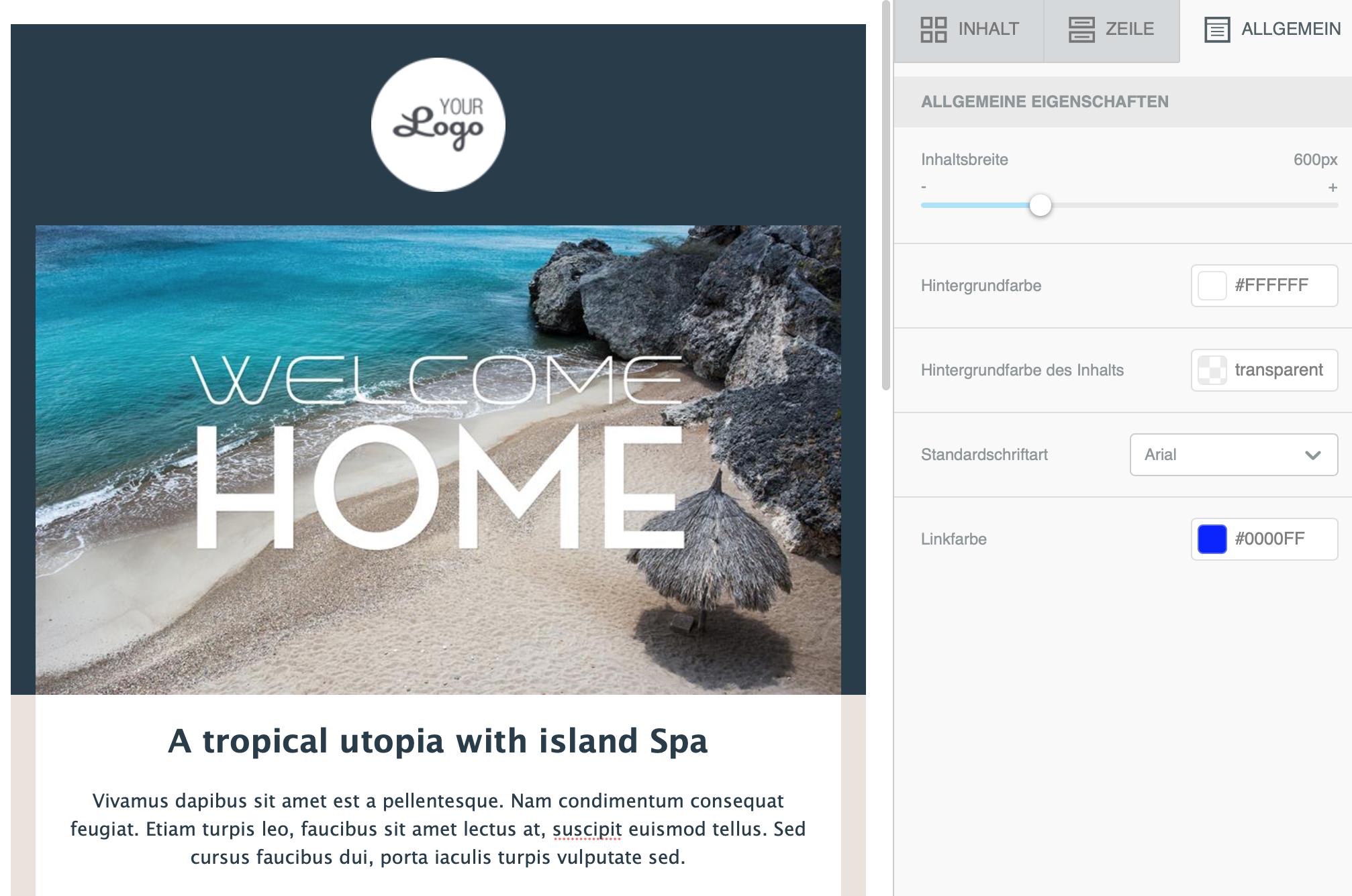
General options for the email layout
The settings made here are inherited by the structure and the content blocks. If, for example, you set the font here, this font is used throughout the message. Independently of this, you can override the general font in a content block.
Options
- Content width: the (maximum) width of the message content. This width is ignored on mobile devices. It only applies if the recipient's display is wider than this width.
- Background colour: the default background colour of the message. Can be overridden in the properties of rows and columns.
- Content background colour: the default background colour of the content blocks. Can also be overridden in the properties of each block.
- Font: font for the whole message unless explicitly set in the content blocks.
- Link colour: the colour of links. Can also be changed for individual links.
These settings are very helpful for quickly achieving a consistent look.
Layout structure in rows and columns
The structure of every message consists of one or more rows. A row defines the horizontal layout of the message. Each row can contain up to four columns.
Several columns in a row let you show different content blocks side by side. Whichever template you choose, you can add, edit and delete further rows, columns or content at any time.
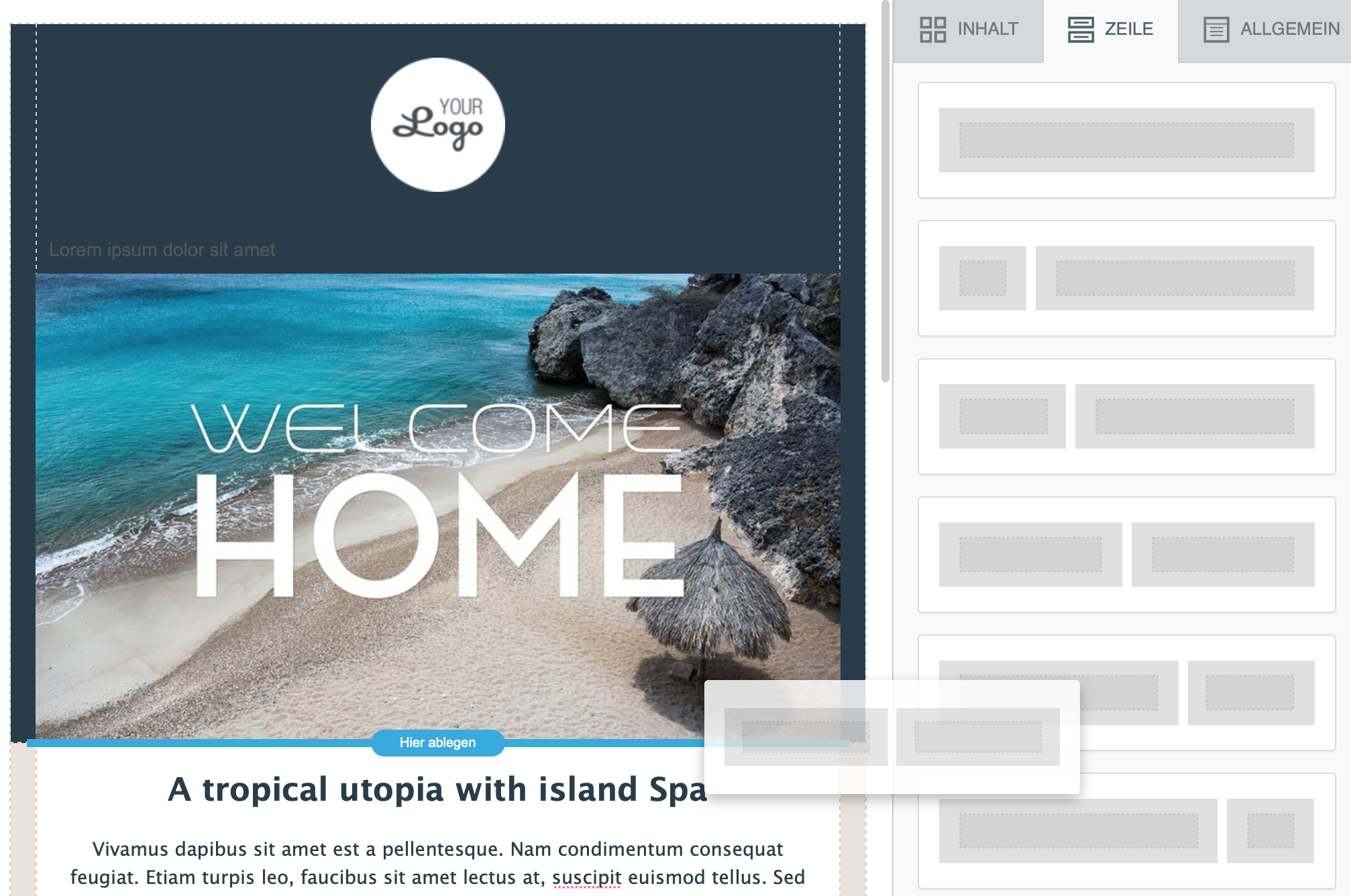
Every row now has its own properties, which gives you incredible flexibility. Until now, these possibilities only existed if you painstakingly created the HTML emails yourself.
Inserting content
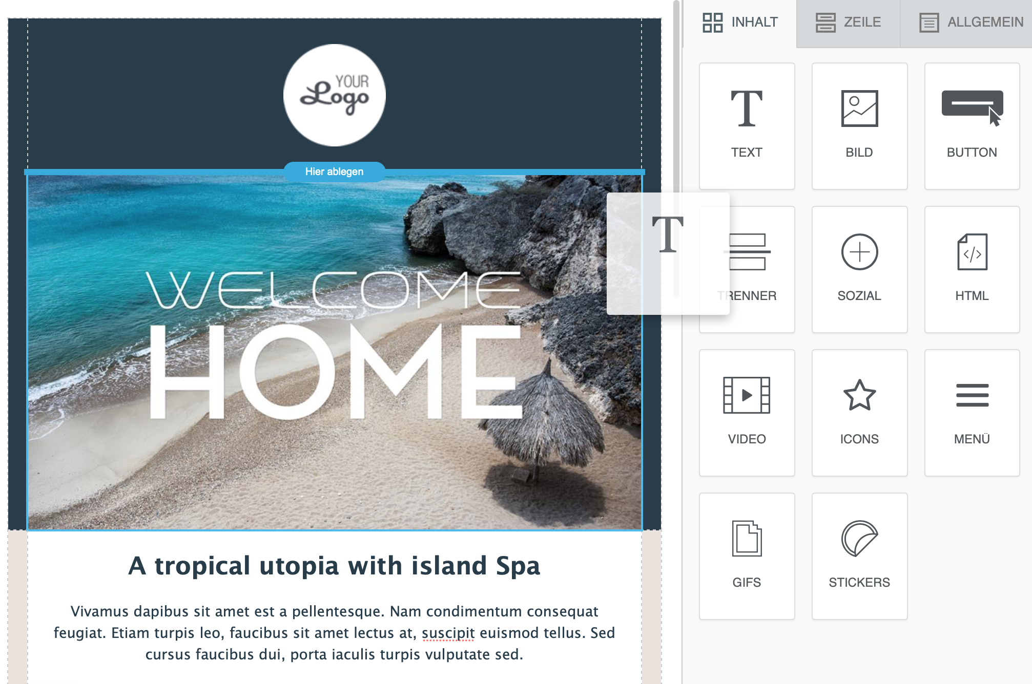
This area contains a wealth of blocks representing different content elements. Each content element can be placed in a column by drag & drop and automatically adapts to the width of the column.
For every content element you can make your own detailed settings such as Colours, Spacing, Visibility mobile/desktop. When you select the content element, you immediately see the properties of the selected content on the right.
Editing row properties or content
Editing rows & row properties
To edit a row or its properties, move the mouse over an area of the row that does not contain a content element.
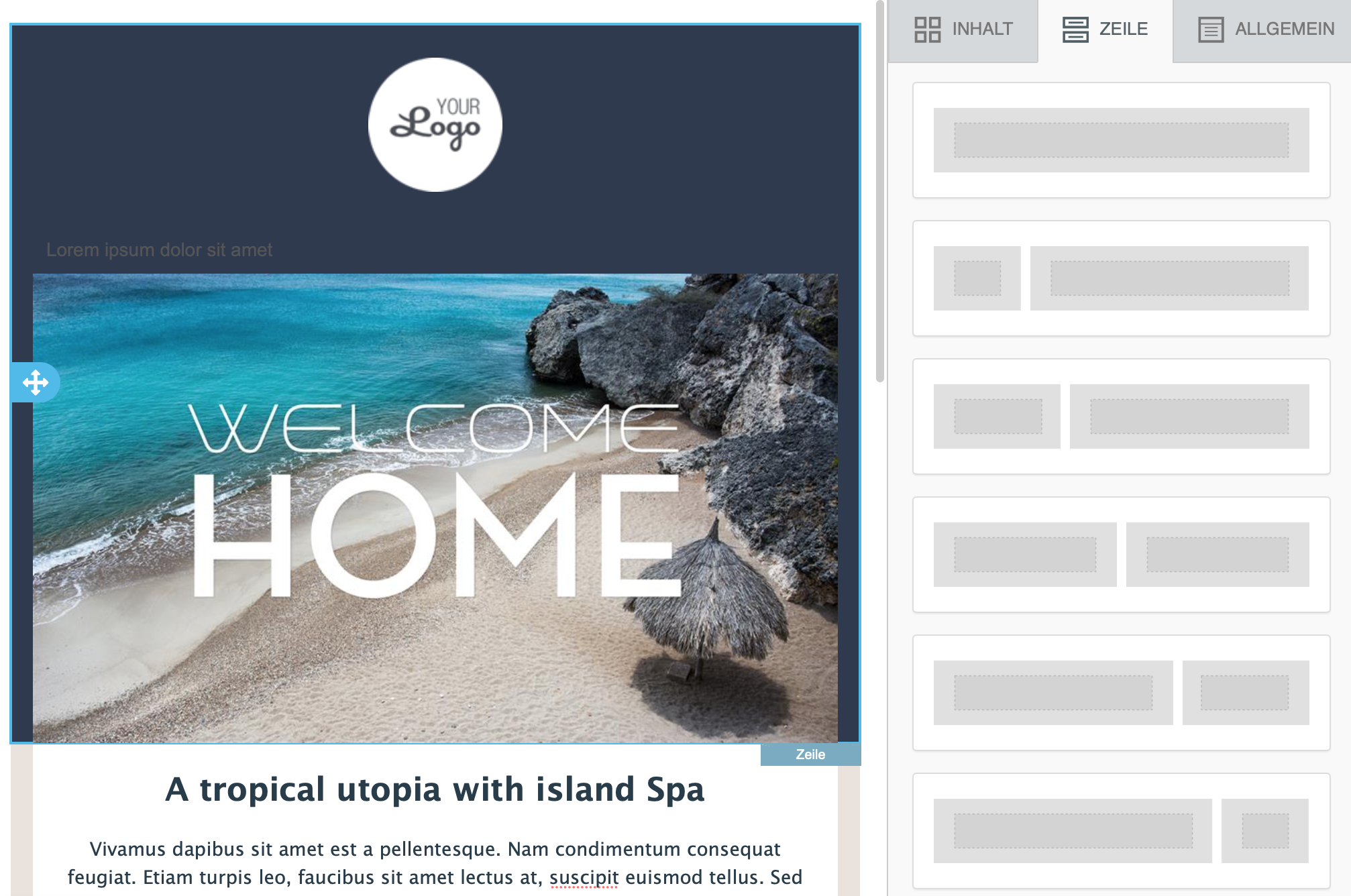
When you now click on the row, the editor will:
- show you several icons for editing the row (copy, move or delete the whole row)
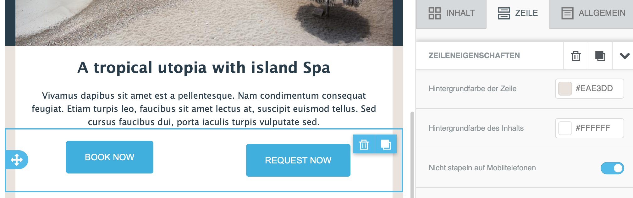
- show the properties of the row on the right. One or more column properties can be adjusted here.
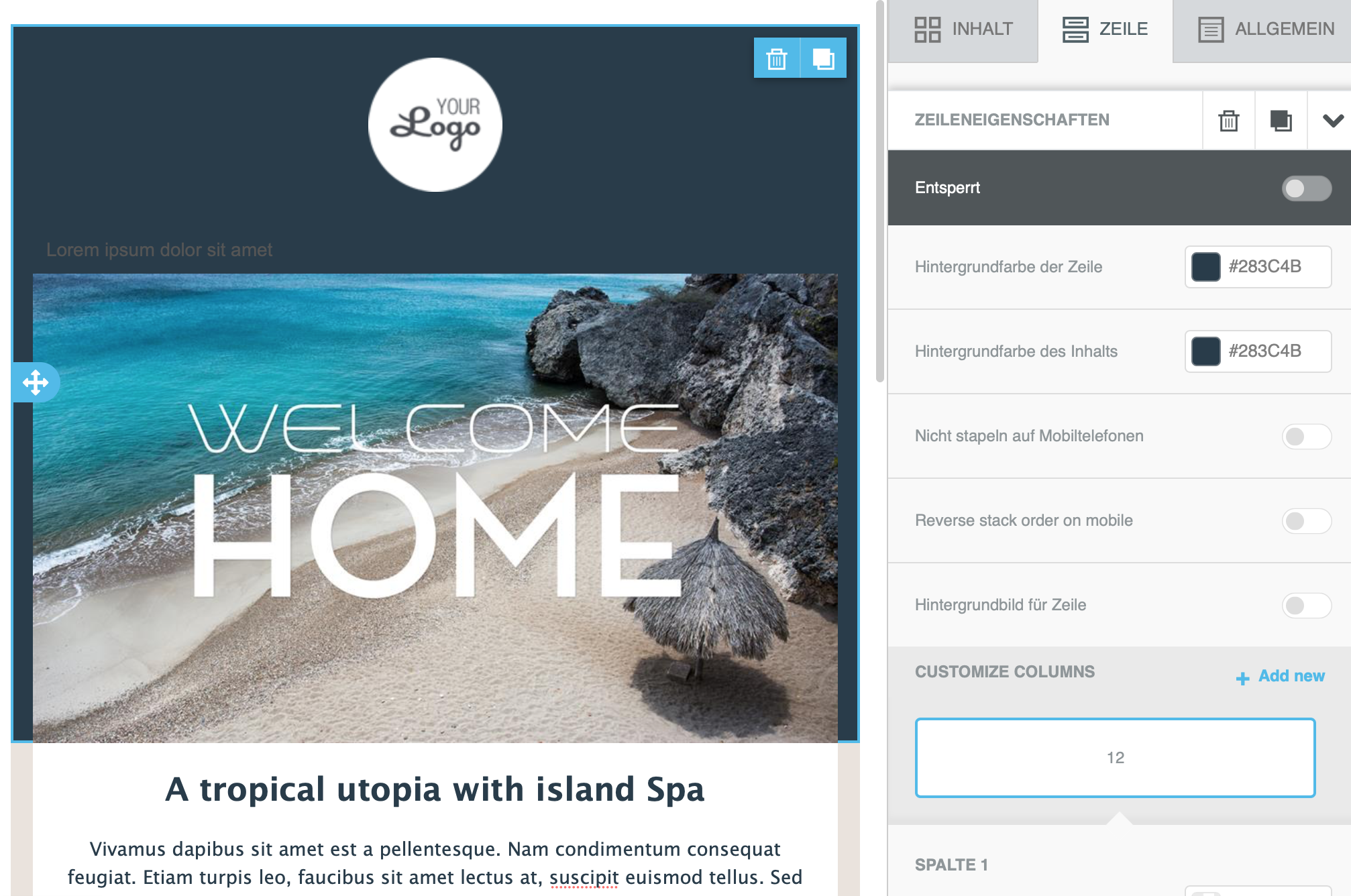
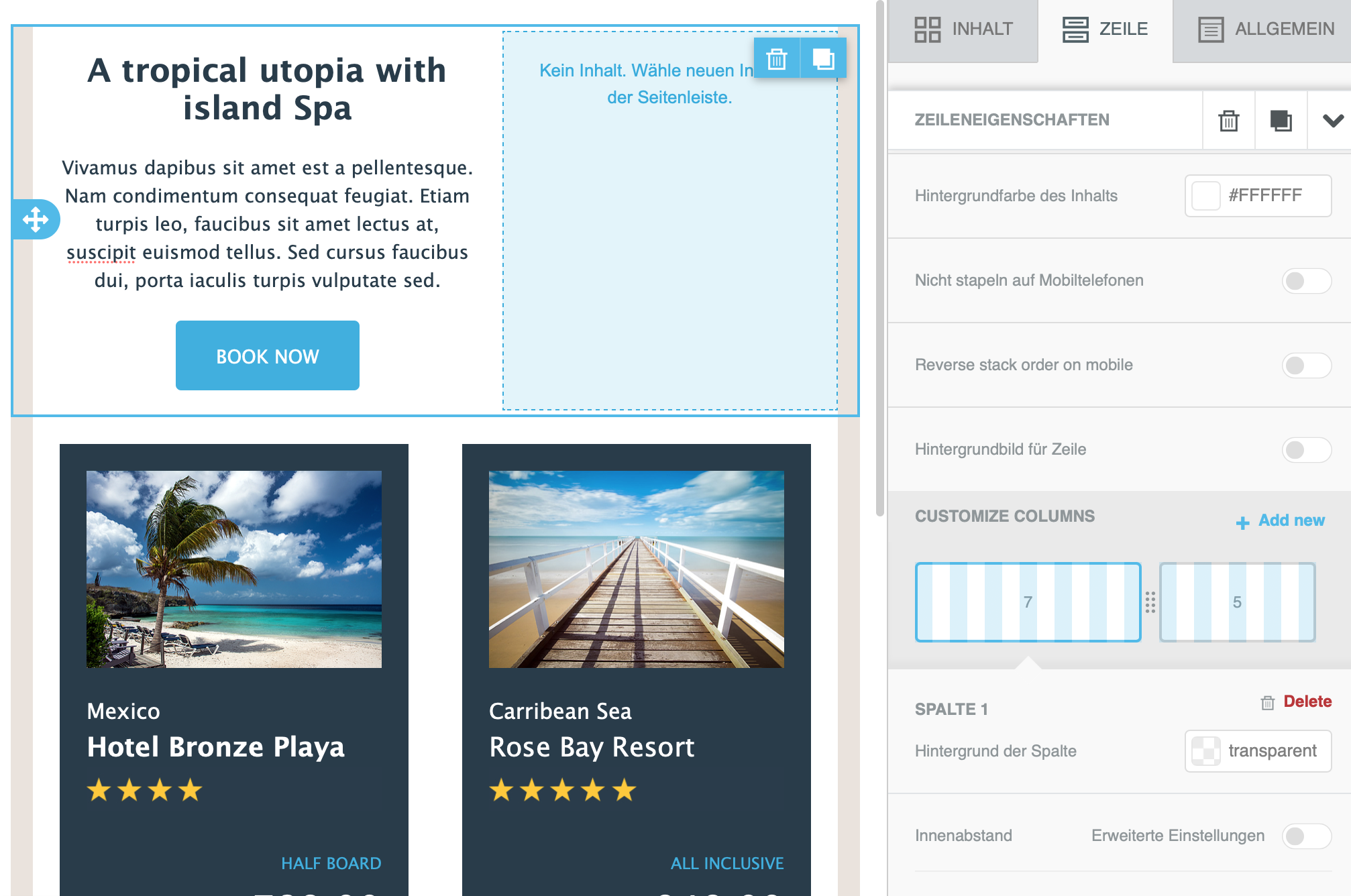
Changes to these properties apply to the whole row (background colour, background image, spacing etc.). In this view you can also add or delete columns in the selected row. To change the column size, use the slider between the columns:
Editing content elements
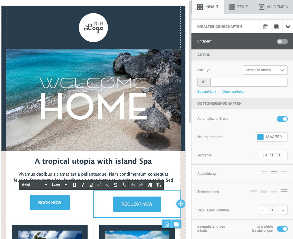
When you click on a content element in a row, the editor will:
- show you several icons for editing the content element (copy, move or delete the content)
- show the detailed properties of the content on the right:
Adding and editing columns
Column management offers you the following options:
- Easily make each column smaller or larger.
- Adjust the width of a column individually.
- Add or delete a column in a row.
- Align up to 6 images in a row.
Overview
To edit the column properties, select the row you want. The options are now shown on the right.
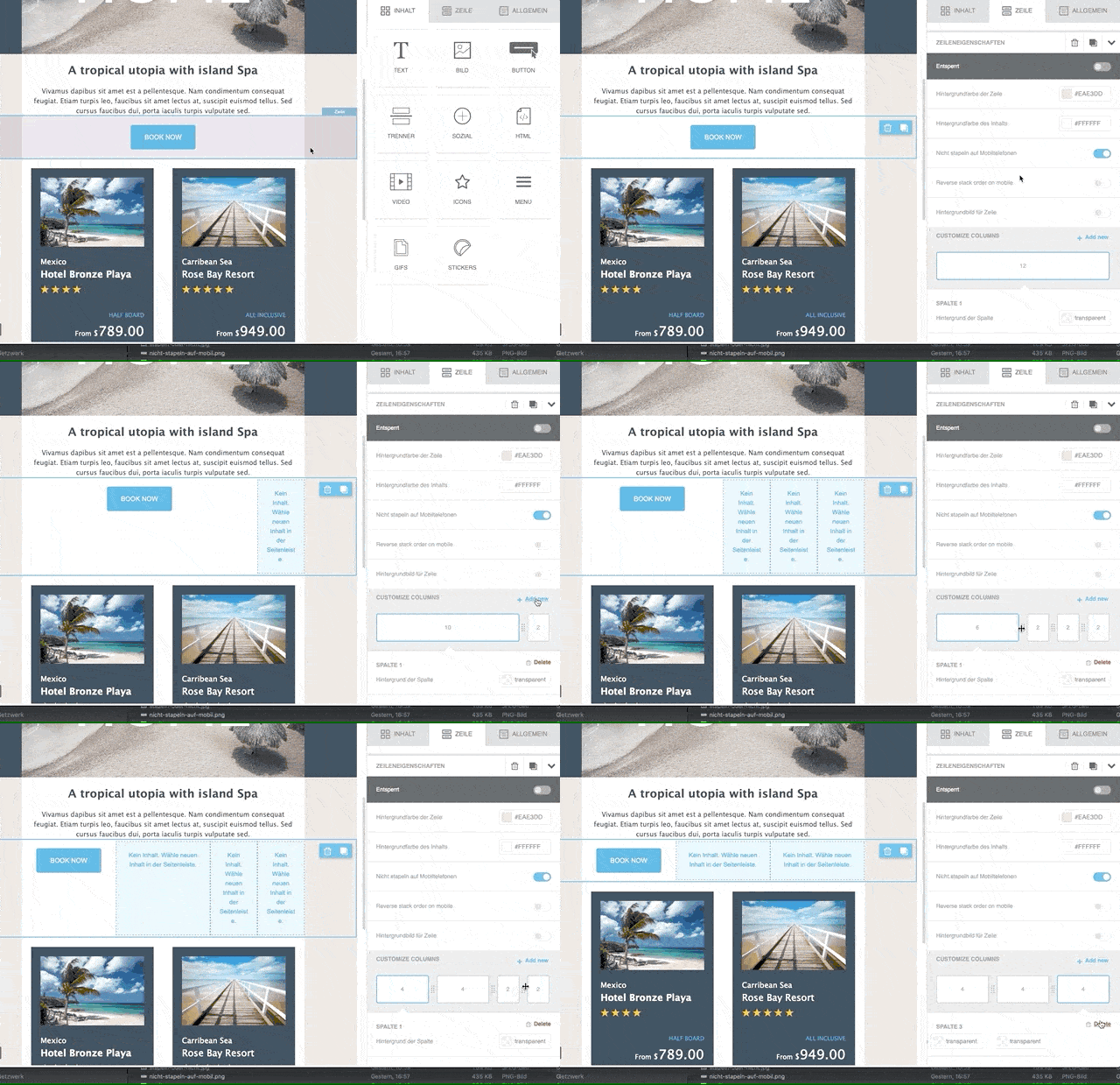
Adding a column
Click + Add to add a new column to the selected row. The new column is added automatically on the right and the column to its left becomes smaller. The smallest column width is 2. This means that a row can contain a maximum of 6 columns:
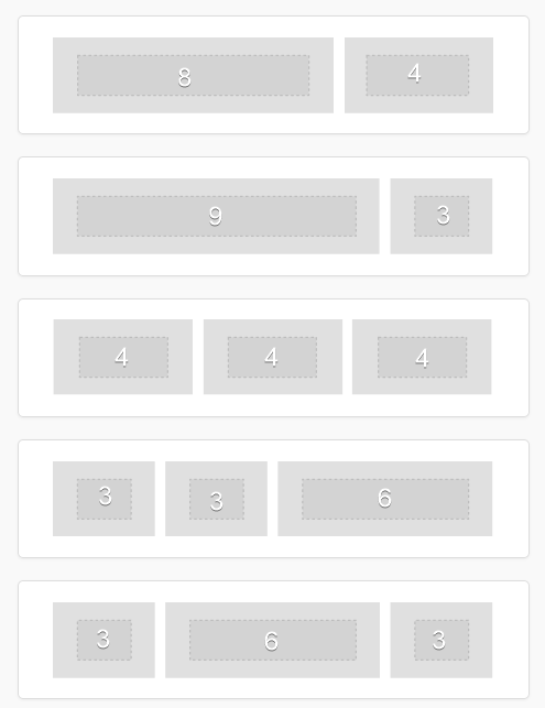
Removing columns
In the properties of the column, click Delete at the top right to delete the currently selected column. When a column is deleted, the column to its left takes over its width. If there is no column to the left, the column to the right takes over the width.
Column layout on mobile devices with the "do not stack" option
Newsletter content is very often organised in several columns. On smartphones or tablets, however, these columns are often very narrow and make the message harder to read. The HTML code generated by the editor therefore stacks these columns one below the other to ensure readability. This means there is no need to zoom in on individual areas, and scrolling with a finger is easy. You will find details under responsive vs. non-responsive design.
Desktop and mobile compared
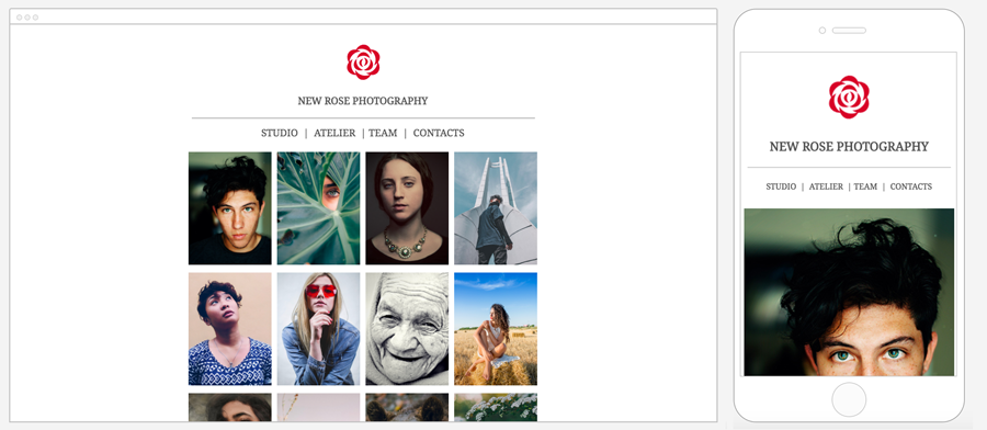
Vertical stacking is supported by most email applications. In very few cases the desktop view is shown. This happens when the software does not support CSS.
The exception proves the rule
Even though this solution helps in almost all situations, there are some cases in which this behaviour does not give the best result. A common scenario is a navigation row with links or icons. As the following screenshot shows, wrapping the columns creates a lot of empty space and unnecessarily hides other elements of the message.
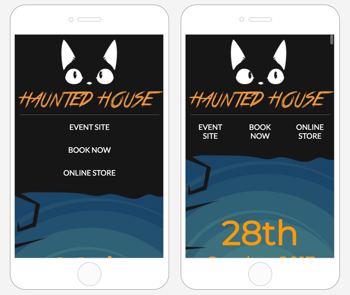
Changing the default setting
With the option Do not stack on mobile you can decide yourself that the content should not be wrapped or stacked: